Red Arrows


Joined: Jul 2007
Posts: 3,304
Likes: 1
From: @exRAF_Al
With the most sincere and greatest of respect to Red 1, he should stick to being one of the trickest pilots we've got. Instead of presenting us with this abomination that looks like it was rustled up in a local primary school competition, we should spend time sponging some free advice from the best brand consultants we've got, to go with one of the UKs best brands.
For a moment, forget the virtues of continuity and tradition and precedent, and all that guff. For so many commercial and marketing reasons, that new scheme is appalling. Why on earth has an established brand seen fit to start amplifying on what it is, let alone what it stands for, after 40 years of exposure? Why on earth should a Red Arrow feel the need to display his levels of pride too? If the public doesn't know by now then this ISN'T the way to go about telling those who need educating. Once you have to tell people who you are, or that you're 'proud to represent the Royal Air Force' of all things, you've lost.
With the greatest of respect too, saying stuff like.. 'we are a visible way of reminding people of our colleagues� hard work and professionalism in the line of duty', all we will do, is remind people that we have people doing aerobatics and going home to nice warm houses, when we have people facing danger and going home to a crappy cold tent. Thats being generous in fact. Because your bog standard bloke in the street won't make the connection anyway, and if he does, you'll have had to tell him about it, which again, creates new hierarchal issues with brand values and.. oh god, this is just too awful.
The best motoring brands, such as Bentley, Audi etc, make do without telling the world who they are. They don't need to, because they are known as the best, and thats good enough for them. They rise above the like of Skoda and Ford. They simply rely on a 'brand' perception, a logo, an image.. a set of values. Call me stupid, but isn't the roundel good enough for these people any more? Just try changing it in 5 years time too, and see what happens when you want to undo the harm you've done.
Dreadful dreadful dreadful. Now we're treating a Hawk like a RAF key ring.
Joined: Oct 2007
Posts: 17
Likes: 0
From: England
What about these nice sedated a/c? 
http://thunderbirds.airforce.com/mediakit/p13.html
http://www.bluejacket.com/usn/images...gels_pcola.jpg
http://thunderbirds.airforce.com/mediakit/p13.html
http://www.bluejacket.com/usn/images...gels_pcola.jpg
Red On, Green On
Joined: May 2004
Posts: 6,490
Likes: 2
From: Between the woods and the water
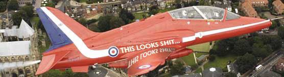
�The Red Arrows� Hawk aircraft are known and loved by millions of people around the world.� said Wing Commander Jas Hawker, Red 1. �We needed to keep a careful balance between making our famous aircraft unrecognisable and reminding people that we are proud to represent the Royal Air Force. This is especially important when many Royal Air Force personnel are away from home, serving overseas in front line operations such as Afghanistan and Iraq. We are a visible way of reminding people of our colleagues� hard work and professionalism in the line of duty. The change to our aircraft paint scheme will help us to do this more effectively.�
Joined: Oct 2004
Posts: 431
Likes: 0
From: Up there somewhere
The logo just makes it too messy... it certainly wasn't needed. Like anyone needs reminding that the Red Arrows are from the Royal Air Force with a dodgy Y and A
Speaking of corporate cr@p - I actually saw someone wearing one of those RAF wannabe flying jackets the other day IN PUBLIC
Speaking of corporate cr@p - I actually saw someone wearing one of those RAF wannabe flying jackets the other day IN PUBLIC

Joined: Jan 2003
Posts: 1,019
Likes: 18
From: Bourton-on-the-Water
I've probably watched the Reds display as much as most people - and I don't really think the three words (however spelt) will be particularly visible when viewed from the average crowd line at a display.
That's not to disagree with much of what's been said here - merely to suggest it doesn't matter much.
Off to the Dubai air show next week - I'll report on what it looks like there....
airsound
That's not to disagree with much of what's been said here - merely to suggest it doesn't matter much.
Off to the Dubai air show next week - I'll report on what it looks like there....
airsound

Joined: May 1999
Aviation Qualifications: ATP+Mil
Posts: 27,399
Likes: 857
From: Quite near 'An aerodrome somewhere in England'
"The logo just makes it too messy... it certainly wasn't needed. Like anyone needs reminding that the Red Arrows are from the Royal Air Force with a dodgy Y and A"
It reminds me of the days of Letraset - when you'd run out of the right font and have to find the nearest similar which would do. Hoping that no-one would notice.
What utter wanquerre came up with that awful design? Someone in the 'Corporate branding and marketing' department of the mad MoD box?
It simply says "Sorry, we ran out of letters and can't afford any more the right size"
Great 'Royal Air Farce' photoshop, November4! And Al R, very wise words indeed.


JetBlast member 2005.
JetBlast member 2006.
Banned 2007
JetBlast member 2006.
Banned 2007
Joined: Apr 2006
Posts: 10
Likes: 0
From: The US of A - sort of
This was the bit that confused me

...or was that a Freudian misquote?
�We needed to keep a careful balance between making our famous aircraft unrecognisable ... �
...or was that a Freudian misquote?


Joined: Apr 2004
Posts: 660
Likes: 0
From: Europe
Looks terrible. No need to worry about how much was spent on consultancy for this - not even a consultancy would come up with something this bad surely (if they did then thats another scandal altogether).
Tapering letters, sloping A & Y. My goodness what a complete design mess! Looks to me like an in-house total amateur job - sadly looks like not enough people were asked if it looked any good. Other theory is that someone senior thought of it, were told it was crap but ignored them by deluding themselves they were in possession of great vision, could see the big picture, "I'm sure I'm right" etc. etc.
Still, on the bright side it makes you realise how good & enduring the original design was.
Joined: Nov 2005
Posts: 927
Likes: 0
From: Sheffield
Guess it was inevitable. That's the RAF's shiny new "corporate" titling with it's own distinctive (and universally disliked) font. Spare a thought for Mr H as I'm sure it wasn't exactly his idea!
Sadly, it's a symptom of just how tiresome the RAF's current PR guru's are. From my own experience and observations they really don't have a clue and they're doing the poor men and women of the RAF no favours at all.
Wonder how long it will be before the titles start appearing on aircraft other than helicopters? Not long I fear!
The bit that makes me laugh is how they've jumped on their copyrighted "RAF marking" which is of course a British Military Roundel. Not quite sure how they can lay claim to something which wasn't theirs in the first place. Still, nothing surprises me about these guys any more.
Joined: Dec 2002
Posts: 806
Likes: 0
From: UK
Fantastic bit of politicking by Red One there.
To make a connection between "Red Arrows" and "Operational Theatres" via paint schemes and the corporate logo deserves an AFC all by itself.
To make a connection between "Red Arrows" and "Operational Theatres" via paint schemes and the corporate logo deserves an AFC all by itself.