


Lufthansa new C/S

Thread Starter
Join Date: Oct 2016
Location: Most locked down city in the world
Posts: 546
Likes: 0
Received 0 Likes
on
0 Posts
This new Lufthansa c/s looks totally non German. It looks uninspiring bland boring and unimaginative like a lot of c/s today. Another totally white
body. Looks like one of those freighters. Even the freighters in the 70s
had more charisma i.e. Flying Tigers, Seaboard World, Trans international.
What has ever happened to the beautiful Cheat line C/L that use to run
along the fuselage? What a disgrace?
body. Looks like one of those freighters. Even the freighters in the 70s
had more charisma i.e. Flying Tigers, Seaboard World, Trans international.
What has ever happened to the beautiful Cheat line C/L that use to run
along the fuselage? What a disgrace?


Join Date: Jul 2009
Location: NI
Posts: 1,033
Likes: 0
Received 0 Likes
on
0 Posts
Very bland and monochromatic, with not even a belly-logo to break up the white canvas. But at least not as disjointed and fussy as Air Canada's recent effort.
It's not particularly original either; even the 'innovative' white leading-edge to the fin has precedent:

There is a design overview video on Youtube, in German. They will keep yellow as a highlight colour for customer interaction, though that means non-customers won't ever see it.
It's not particularly original either; even the 'innovative' white leading-edge to the fin has precedent:
There is a design overview video on Youtube, in German. They will keep yellow as a highlight colour for customer interaction, though that means non-customers won't ever see it.
Gnome de PPRuNe
Join Date: Jan 2002
Location: Too close to Croydon for comfort
Age: 60
Posts: 12,636
Received 300 Likes
on
168 Posts
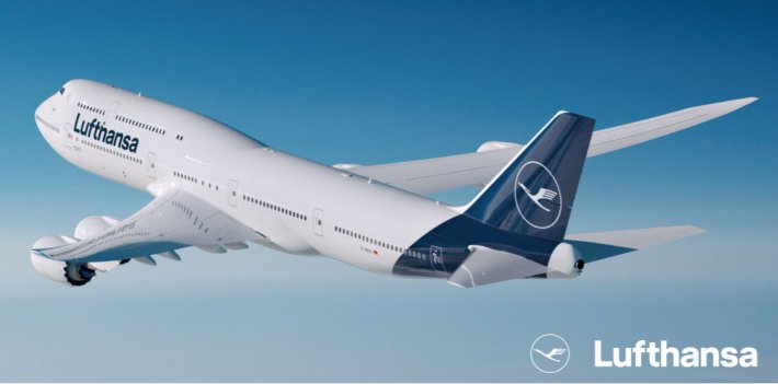
Did a quick google to see what you were talking about - I agree it is bland, judicious use of yellow (which i seem to recall is a complimentary colour to blue), perhaps a leading edge to the tail and maybe the engines would help.
Isn't it time Air France had a makeover; the basic scheme has been around since about 1975 I think, don't know if there have been any subtle changes since?
If the reason for a colour scheme is to advertise your airline then taking away the big yellow spot has made Lufthansa just another blue tail among all the others.
Join Date: Jun 2010
Location: Newcastle
Posts: 1,063
Likes: 0
Received 0 Likes
on
0 Posts
What is going through these people's minds? Are they actually competing to see who can have the most bland livery? The new Iberia c/s is the worst imho, if only because it replaced one of the greatest and most distinctive schemes around.
Join Date: Jun 2007
Location: Beyond the Blue Horizon
Age: 63
Posts: 1,257
Received 168 Likes
on
103 Posts
Max Angle
I flew with them yesterday and got the same comment as you from CC. They were not happy with losing the Yellow background, and I agree it is very poor in comparison with what they have currently. They must be giving up one of the longest lived and easily identifiable logos in airline history, which is a shame especially when you se what they chose and indeed how much they will have paid for someone to develop this new some what anaemic / bland look. I hope this is not a sign of things to come as I use them quite a lot.
Kind regards
Mr Mac
Join Date: Jul 2009
Location: NI
Posts: 1,033
Likes: 0
Received 0 Likes
on
0 Posts
What is going through these people's minds?
'Formulate the most premium blue that you can...'
https://www.youtube.com/watch?v=FoLW...=youtu.be&t=85
Also much nodding and neck-beard stroking.
English presentation, less insightful than the German oneabove:
Join Date: Jun 2007
Location: Beyond the Blue Horizon
Age: 63
Posts: 1,257
Received 168 Likes
on
103 Posts
El Bunto
Thanks for posting that. It does explain a lot but the losing the Yellow makes the hole thing look more bland not "richer" IMHO. In a previous company I went through this exercise when a new CEO joined. Most were supportive of the change to be honest, but it was a poor imitation of what we had before and being some what older I voiced my opinion at a staff meeting and it turned out it was a little "emperors new clothes" if you get my drift. Anyway new CEO stayed for 2 years before running off on the MBA merry go round these people have, to no doubt do more brand changing elsewhere. Incoming CEO changed brand back to something similar to previous. Cost to business circa �3m and we were not a large business, and this was done at a time of recession and pay freezes / redundancy so not a happy workforce either.
Regards
Mr Mac
Join Date: Jun 1999
Location: world
Posts: 3,424
Likes: 0
Received 0 Likes
on
0 Posts
I got to just over a third of the way and had to give up on that video. What it boils down to is that they actually and naively believe the PR bull they spout out. The bottom line Lufthansa is that it's BLAND and does NOT project an image which distinguishes you from your competitors!
Join Date: May 2011
Location: Hampshire
Age: 76
Posts: 821
Likes: 0
Received 0 Likes
on
0 Posts
I disagree with the description of bland. I don't think it is that bad. At least the Lufthansa tails no longer resemble a Cadburys Creme Egg!
Here is one that arrived at LHR today:
Ship Photos, Container ships, tankers, cruise ships, bulkers, tugs etc
Here is one that arrived at LHR today:
Ship Photos, Container ships, tankers, cruise ships, bulkers, tugs etc
Join Date: Jun 2010
Location: Newcastle
Posts: 1,063
Likes: 0
Received 0 Likes
on
0 Posts
My god, that photo encapsulates three things that just get my goat about airlines:
This aircraft used to be called 'Rosenheim'. Now it appears to be called '#explore the new'
The above 'name'/ 'hashtag', whatever it is, is in English. They're a German airline fcs.
As discussed above the colour scheme is dire (in my humble opinion anyway - it's in the eye of the beholder, I appreciate)
I think someone at Lufthansa trying to wind me up personally