


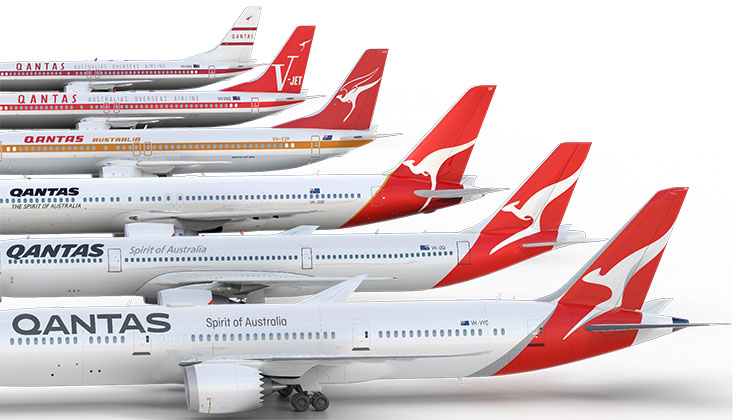
New Qantas livery.

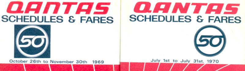
In the lead up to Qantas' 50th anniversary in 1970 the logotype was revised with a more "chunky" style. Initially the "n" was a lowercase character but this was soon changed to uppercase. I seem to recall that this was because the lowercase "n" represented another letter in some languages. I think the all uppercase version looked better than anything before or since.

Were QANTAS the first to use the kangaroo logo?
I have been researching some historic stuff around Thornton, Victoria when I was shown a photo which piqued my interest. Story attached.
Okay, I could of course be completely wrong here, it happens all the time but I notice Alan seems to be preoccupied with the logo/branding. Having removed the kangaroo from the uniforms, see below, I wonder if the evolution of the kangaroo on the tail is designed to progress to a white swirl on a red tail, eventually becoming a hint or nod towards being an image of a kangaroo. An abstract image if you like.
In an attempt to "internationalise" the brand and remove the cultural reference to make it more palatable to someone?


Join Date: Apr 2015
Location: Earth
Posts: 82
Likes: 0
Received 0 Likes
on
0 Posts
In an attempt to "internationalise" the brand and remove the cultural reference to make it more palatable to someone?
Get off your paranoid horse.

Nunc est bibendum
They've left out a very subtle change on one of those aeroplanes. After the merger (takeover) of Australian QF for a time dropped the 'spirit of Australia' slogan and became 'the Australian airline' as a nod to the former domestic carrier. Not sure how long it last but it was a few years- maybe 5 or so from end of 92 or early '93 through until at least '97 or so because I think it was still current when I checked out as an F/O.
No change t the roo though so technically doesn't fit the 'logo' change but it was a livery change.
No change t the roo though so technically doesn't fit the 'logo' change but it was a livery change.
RENURPP
Re the cosmetic looks of contractor aircraft (or any aircraft that I fly in as a customer), I expect the looks of the aircraft inside and outside to be reasonable.
I like the new QF livery, good business strategy changing the visual image of any organisation on a regular basis.
Re the cosmetic looks of contractor aircraft (or any aircraft that I fly in as a customer), I expect the looks of the aircraft inside and outside to be reasonable.
I like the new QF livery, good business strategy changing the visual image of any organisation on a regular basis.

It's a bit of a dog's breakfast! The first thing I notice is that the "Q" seems to be from a different font family. There is too much real estate between the Q and the A.
They have an old logo mark under the flight deck windows (love it!) but another one on the cowls. I think the 'nose' mark should have been repeated on the cowls as the second image makes the overall livery look too busy and disjointed. I assume that there's a third version on the inside of the winglets.
All in all, what is now RetroRoo II cannot be beaten. The new version makes Qantas look even more like Iberia's latest livery. Finally, as Qantas is often known as the Flying Kangaroo, why the hell don't they reinstate the wings????

Folks,
Love the new jacket rules --- will be "on" up to 27C --- that's stepping right back to the old PanAm uniform rules.
Will a recording thermometer be part of the uniform issue??
Will there be a new outbreak of the short versus long sleeve shirt controversy.
Will allegations of "coats off" at 26C be a "tea and biccies" matter??
As for "what's old is new again", I still have my original white hat.
Tootle pip!!
Join Date: Feb 2004
Location: Australia
Posts: 1,307
Likes: 0
Received 0 Likes
on
0 Posts
It doesn't look like a roo especially to someone who has never seen one, it looks more like a clothes peg.
Everything is out of proportion. No arms, no chest.. Just a head stuck on a two-bladed ninja throwing star. The feet look like they would impale the ground. It also looks like it's tail heavy, like it would fall on its @ss (not a good impression).
I have the feeling the alternative designs were so bad, this designed qualified only because it was the best of the bad.
There was a mention earlier of some 'real estate' betwixt the Q and the A, have a gander back at the pic at Ixarus' post - there's room there for a full sub-division, back abt the V-jet times. And if you think the roo looks ugly now, have a look at the attachment to Post 43, which has now been approved.

Yeah of course. That's why 'Spirit of Australia' is still written on the side of the aircraft......to remove cultural reference.
Get off your paranoid horse.
Get off your paranoid horse.
Qantas, I still call Australia 51% home.
Join Date: Dec 2000
Location: Horsham, England, UK. ---o--O--o---
Posts: 1,185
Received 4 Likes
on
2 Posts
Yeah, the engines look a bit too "plain" without the roo on them!
Mind you, the roo on the tail looks a bit like a pterodactyl now..
Mind you, the roo on the tail looks a bit like a pterodactyl now..
Join Date: Oct 2016
Location: Everywhere
Posts: 159
Likes: 0
Received 0 Likes
on
0 Posts
Has anyone else noticed what a triumph of 'spin over substance' modern management are?
The livery has been changed on an aircraft still not delivered.
There will be in excess of 500 of these aircraft (787) flying in the world, even Lan Chile operate them, Jetstar have for a few years too
A media buzz over a seat?
Sounds like the 25 year old marketing kid work experience project.
Another release for menu changes, premium economy seats?
Then again it's all about 'transformation' right...
Last edited by Tuck Mach; 31st Oct 2016 at 20:13. Reason: typo.
Nunc est bibendum
They have- it looks less like a roo than the one on the tail. Piccie here.