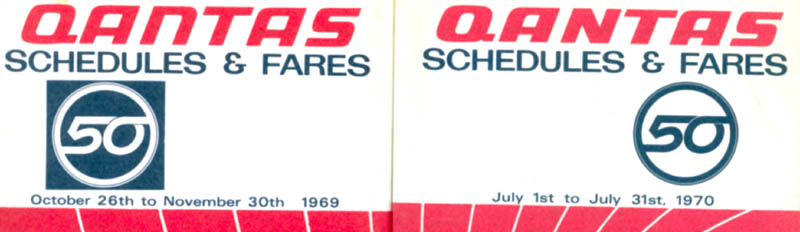
In the lead up to Qantas' 50th anniversary in 1970 the logotype was revised with a more "chunky" style. Initially the "n" was a lowercase character but this was soon changed to uppercase. I seem to recall that this was because the lowercase "n" represented another letter in some languages. I think the all uppercase version looked better than anything before or since.