fdr
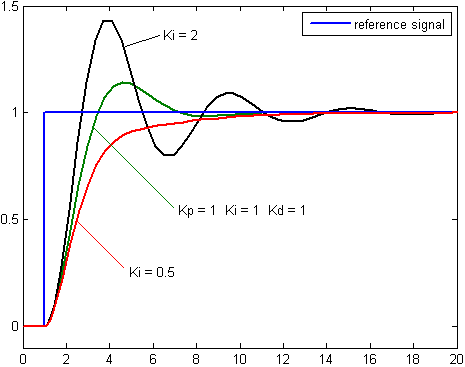
I had another look. It's very obviously the same image with some photoshopping. The labels on the wiki graphs are correct, the ones in your copy are incorrect. You need to read the captions to the graphs.
I'm certain that someone who didn't understand the charts copied them from wikipedia and then incorrectly altered them.
It looks like your "controller theory textbook" ripped the image from here
https://theautomization.com/pid-cont...detail-part-2/. I can still see remnants of the red and green caption.
https://en.wikipedia.org/wiki/PID_co...ge_with_Ki.png