Originally Posted by
slats11
Anyway I looked at 7 different provinces, and looked at [two data points]...
...this dramatic increase over 34 hours can surely only be described as exponential.
Rubbish. It is mathematically impossible to establish an exponential function from only two data points. You have only described a linear function.
"Exponential" means a data series
increases changes by x% each time period and requires more than two data points.
In the absence of any quarantine or immunisation methods a typical contagious disease exhibits an exponential growth. Note the caveat: as soon as measures are taken to contain an outbreak the function is no longer exponential.
The very data series you quoted shows this (try this website from
John Hopkins University for example,
WHO has a similar page). Up to five days ago the series increased by roughly 50% per day. From four/five days ago the series increased by around 25% per day. You can see this in the data series for the total cases worldwide, the cases of Hubei province alone (which you claimed was false data)
and the cases for China outside Hubei province (edited: not sure about outside China, too few data points to be certain). This is typical behaviour for a contagion showing that the extreme quarantine measures in China are having an effect.
And I do mean extreme. I live in Shanghai. No cars, taxis, or busses. No stores, banks or government buildings open. Only a few grocery stores with a handful of patrons. Nothing in the streets. It's eerie in a city of 28 million. Can you imagine this in Sydney, or London, or Tokyo? This has been going on for more than a week now, and given the median incubation period is about that, it should show up as a decline in the rate of increase of cases (note: a decline in the rate, not a decline in overall numbers).
Any statement that begins with the words "If the current trend continues..." is a lie. Try to avoid scaremongering and listen to reputable organisations such as WHO, CDC and so forth. There's a world of expertise out there.
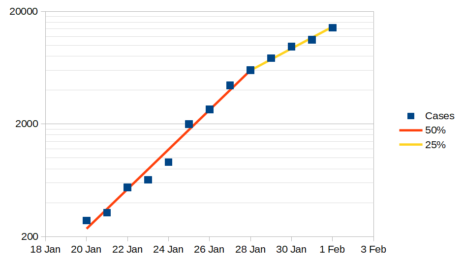 "Cases" are number of cases reported in mainland China, from John Hopkins University.
Y-axis is plotted as a logarithm, so straight lines on graph show the exponential rate.
Coloured lines on chart show daily increase in number of cases reported.