


Speedbird, Hippocampe Ailé, Crane

Thread Starter


Joined: Jan 2000
Aviation Qualifications: SLF
Posts: 1,582
Likes: 312
From: UK and Italy
Speedbird, Hippocampe Ailé, Crane
The Lufthansa crane is probably the most recognisable symbol of an airline. Some people, like Mr Mac, regret that it is now an albino version, having for over 50 years been blue on a golden circle.
The Hippocampe Ailé, the symbol of Air France, doesn't feature on the outside of their aircraft, but it's everywhere on the menus, the light fittings, and the walls and bulkheads of the aircraft.
Aeroflot retains the winged hammer-and-sickle of Soviet days, they decided that it was so well associated with the airline that a minor detail like the fall of Communism wasn't enough reason to abandon it.
British Airways adopted the Speedbird in 1932, and abandoned it it 1984. It was as recognisable as the symbols of the other airlines abovementioned, but now only features in the callsign of BA aircraft. Why did they ever abandon it? It was as much a symbol of the airline as the red London bus is of London.
Other airline symbools have fallen by the wayside. Air Rhodesia's 'twiggy bird' went with the end of Rhodesia. South African Airways' springbok was too associated with apartheid and had to go (although it's still the symbol of their Rugby teams, both men's and women's). Pan Am's globe only now appears on the sides of freight cars on US railroads, they make a few bob out of royalties from film companies who want to use the logo in films about Pan Am's heyday.
Any other symbols you'd like to comment about? Qantas's flying kangaroo? Air New Zealand's koru (since 1973)? Aer Lingus's trefoil?

Joined: Jun 2007
Aviation Qualifications: Spotter
Posts: 1,885
Likes: 501
From: Beyond the Blue Horizon
Justapax 1
Still trying to find any staff who like the new LH symbol, and believe me I am with them just a bit !
But also one of my senior staff is married to LH senior manager with LH, and they don’t like it either and think it was a big mistake.
I wonder if this rebrand may go the way of the infamous BA World Airline tails ?
Pan Am was as you say another equally iconic tail plane logo.
Cheers
Mr Mac
Joined: Jan 2008
Aviation Qualifications: SLF
Posts: 1,022
Likes: 1,066
From: Australia
Justapax 1
Still trying to find any staff who like the new LH symbol, and believe me I am with them just a bit !
But also one of my senior staff is married to LH senior manager with LH, and they don’t like it either and think it was a big mistake.
I wonder if this rebrand may go the way of the infamous BA World Airline tails ?
Pan Am was as you say another equally iconic tail plane logo.
Cheers
Mr Mac
Still trying to find any staff who like the new LH symbol, and believe me I am with them just a bit !
But also one of my senior staff is married to LH senior manager with LH, and they don’t like it either and think it was a big mistake.
I wonder if this rebrand may go the way of the infamous BA World Airline tails ?
Pan Am was as you say another equally iconic tail plane logo.
Cheers
Mr Mac
It did do one good thing for me though. I was on the shuttle just after they'd introduced it, and after take-off the Captain came on and said "Anyone who can tell us which image we have on the fin, gets to sit on the jump seat for the flight". I guessed, and got it right, spent the flight in the front.
I still think Landor was the best though. But I miss the Speedbird.


PPRuNe Handmaiden

Joined: Feb 1997
Posts: 4,910
Likes: 184
From: Duit On Mon Dei
The flying kangaroo has morphed into an increasingly stylised version of its' former self. Qantas has been pretty clever not to overly mess with the brand, red with a flash of gold, flying rat and the font staying fairly similar over the years. I like the 1984 - 2007 livery, at least the 'roo had paws!
https://www.qantas.com/gb/en/about-u...any/logos.html
https://www.qantas.com/gb/en/about-u...any/logos.html
Joined: Jan 2008
Aviation Qualifications: SLF
Posts: 1,022
Likes: 1,066
From: Australia
The flying kangaroo has morphed into an increasingly stylised version of its' former self. Qantas has been pretty clever not to overly mess with the brand, red with a flash of gold, flying rat and the font staying fairly similar over the years. I like the 1984 - 2007 livery, at least the 'roo had paws!
https://www.qantas.com/gb/en/about-u...any/logos.html
https://www.qantas.com/gb/en/about-u...any/logos.html

Thread Starter
Joined: Jan 2000
Aviation Qualifications: SLF
Posts: 1,582
Likes: 312
From: UK and Italy


Joined: Feb 2015
Aviation Qualifications: PPL
Posts: 1,760
Likes: 358
From: Cincinnati, Ohio
- Ed

Joined: Aug 2001
Aviation Qualifications: Spotter
Posts: 1,829
Likes: 165
From: se england
I think the current BA is good and stylish. They should have kept the Speedbird somewhere . Landor was very dull and old boy britishness. . i also liked the BEA arrow type Union Jack ..
In Europe LH is horrible as is its ugly sister at Finnair , AFs tricolore is nice so long as the planes are clean and they seem to have got better at that than in the past and the hew KLM quite nice
Wait for Trump to insist AA bring back the Eagle and United to have a big US flag somewhere. No doubt many of his supporters would also like Delta to have a flag that represents their Southern Heritage
Gnome de PPRuNe
Joined: Jan 2002
Aviation Qualifications: Spotter
Posts: 15,189
Likes: 1,201
From: Too close to Croydon for comfort
I've got several books on airline colour schemes from the mid 70s... wonderful.
Always liked Tradewind's sail, ONA's ship's wheel, the CP Air design...
Agree Lufthansa's scheme was great back in the day... and it's stylised negative Condor variant.
Always liked Tradewind's sail, ONA's ship's wheel, the CP Air design...
Agree Lufthansa's scheme was great back in the day... and it's stylised negative Condor variant.
Paxing All Over The World

Joined: May 2001
Posts: 10,842
Likes: 328
From: Hertfordshire, UK.
Photos cropped at the top but left the bottom of the pics for the Copyright lines.

Photo Copyright hector A Rivera Valentine on Planespotters.net
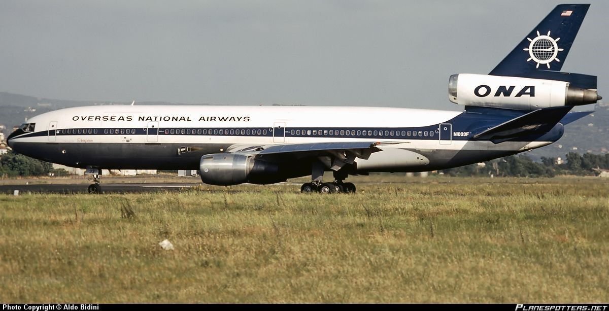
Photo copyright Aldo Bidini
Photo Copyright hector A Rivera Valentine on Planespotters.net
Photo copyright Aldo Bidini


Gnome de PPRuNe
Joined: Jan 2002
Aviation Qualifications: Spotter
Posts: 15,189
Likes: 1,201
From: Too close to Croydon for comfort
Last edited by treadigraph; 6th March 2025 at 04:38.
Joined: Jun 2007
Aviation Qualifications: Spotter
Posts: 1,885
Likes: 501
From: Beyond the Blue Horizon
I think the current BA is good and stylish. They should have kept the Speedbird somewhere . Landor was very dull and old boy britishness. . i also liked the BEA arrow type Union Jack ..
In Europe LH is horrible as is its ugly sister at Finnair , AFs tricolore is nice so long as the planes are clean and they seem to have got better at that than in the past and the hew KLM quite nice
Wait for Trump to insist AA bring back the Eagle and United to have a big US flag somewhere. No doubt many of his supporters would also like Delta to have a flag that represents their Southern Heritage
In Europe LH is horrible as is its ugly sister at Finnair , AFs tricolore is nice so long as the planes are clean and they seem to have got better at that than in the past and the hew KLM quite nice
Wait for Trump to insist AA bring back the Eagle and United to have a big US flag somewhere. No doubt many of his supporters would also like Delta to have a flag that represents their Southern Heritage
I also liked the later BEA Tail with the Union Flag and Blue. Indeed I think I have seen something similar on some Land rover Discovery models and indeed Mini on tail lights and body. It may have been a special addition or option I don't know. As you say LH is terrible, and Finnair not dissimilar. As for Trump and US carriers and the Star Spangled banner I am sure it will come into his head on the 12th hole or over some coming weekend in Florida.
Cheers
Mr Mac
Thread Starter
Joined: Jan 2000
Aviation Qualifications: SLF
Posts: 1,582
Likes: 312
From: UK and Italy
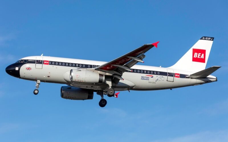
Finnair ain't so bad. Here's an A319 in a livery that looks quite neat (actually I'm being facetious, it is, like the BA A319 in BEA livery, a 'retro look' aeroplane)

This is cut and pasted from Wikipedia, and for some reason I can't get any higher resolution. In the original article you can click on it and get a high-res image.
This is cut and pasted from Wikipedia, and for some reason I can't get any higher resolution. In the original article you can click on it and get a high-res image.
Joined: Jan 2008
Posts: 17,701
Likes: 2,045
From: Reading, UK
