Originally Posted by
Fris B. Fairing
In the lead up to Qantas' 50th anniversary in 1970 the logotype was revised with a more "chunky" style. Initially the "n" was a lowercase character but this was soon changed to uppercase. I seem to recall that this was because the lowercase "n" represented another letter in some languages. I think the all uppercase version looked better than anything before or since.
I remember this... my Mum and Dad still have some collateral that has that lower case N.
Here's my take on the logo... and I do say this from a design background...
There is a history and a character to Qantas typefaces over the years, all since the fifties have been italic, this has formed part of the character of the brand image in our collective minds.
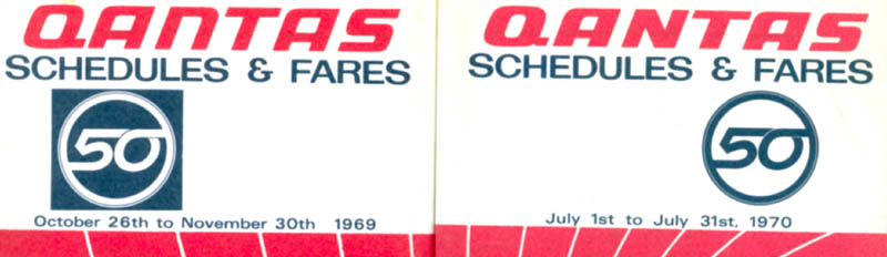
The 60s logotypes were designed by Harry Rogers who also produced all of Qantas' posters during the 50s and 60s. Rogers' design evolved the slight italic character and produced a type style that was thicker and built on the original versions. Rogers also produced the ochre and red livery and the typeface shown in the 50th Anniversary logo was a complete alphabet designed by Rogers for Qantas and it was called 'cyclone'.
In 1984, I think it was fair to say the winged kangaroo was due to evolution, it was very much a forties design and its precept was not adaptable to modern design.
Enter Tony Lunn and Ron Dyer of Lunn, Dyer and Associates who I believe executed probably the most respectful. sound and brilliantly executed re-design I think I've seen.
The development of the triangle motif was brilliant, it effectively took the tail shape and adapted it to be applicable to other items, the triangle 'bleeding' off the edge of letterhead, etc. was the mark of a truly good design - one that looks natural on any item it is applied to - geometrically it was well sorted also - the kangaroo's nose, tail and foot all touched the triangle at the mid point of each axis. The word Qantas similarly, was precisely one half the height of the triangle. It was a very unified design.
It did this by showing respect for the previous liveries by an evolution of Harry Rogers' cyclone font, matching it with Helvetica italic light which lent a unified look to less important text as a natural extension of the logotype.
Enter 2007 and the need to take account of non-paint areas of the tail-plane and Hans Hulsbosch executed probably the worst adaptation possible. The synergy between the triangle and the word Qantas in the logotype was broken, the word looking like it was just thrown next to the logo or that something had gone wrong in the printing process and it wasn't properly aligned. The kangaroo lost it's grace (Lunn/Dyer actually used the original kangaroo ever so slightly modified with the wing removed), becoming something wholly different with all the wrong proportions. What is even more annoying is the number of times that it has been wrongly commented that Hulsbosch designed the 1984 livery and he never corrects those mis-perceptions.
Now we move to 2016. The typeface goes against the grain of all the previous ones, it has no sympathy with Qantas' brand image through 60-70 years. The silver area in front of the tail is an afterthought and cynically, just replaces the gold stripe Hulsbosch removed in 2007 (albeit thicker at the base). The replacement of the triangle motif with that silly tail shaped thing makes the whole logotype when stacked on top of each other look like it's falling over backwards - hardly forward movement of the old logo or any previous livery... when the tail shape precedes the word Qantas in the new typeface (horizontal logotype) it has no connection or synergy and the typeface looks like it's backhand.
And please, can the media stop the rubbish about it now being possible to know it's Qantas flying over because of the name on the underside... ANY aircraft that flies over is obviously Qantas from almost any altitude because of the way the read wraps around under the fuselage - side on, it's one of the most recognizable liveries from miles away because of the large area of red at the rear.
To me, this is a complete waste of money. The typeface will date very quickly and I wouldn't be surprised if there's another re-brand in 5 or so years.
What was wrong with the 1984 livery and if it needed sight revisions, why didn't they just engage Tony Lunn or Ron Dyer who are still active come in and modify it.