Originally Posted by
Lead Balloon
Genuine question, Mick: What is the definition of "low exposure risk" for the purposes of that 'infographic'? Is it just '2 per 10,000'? I'm not sure what that means.
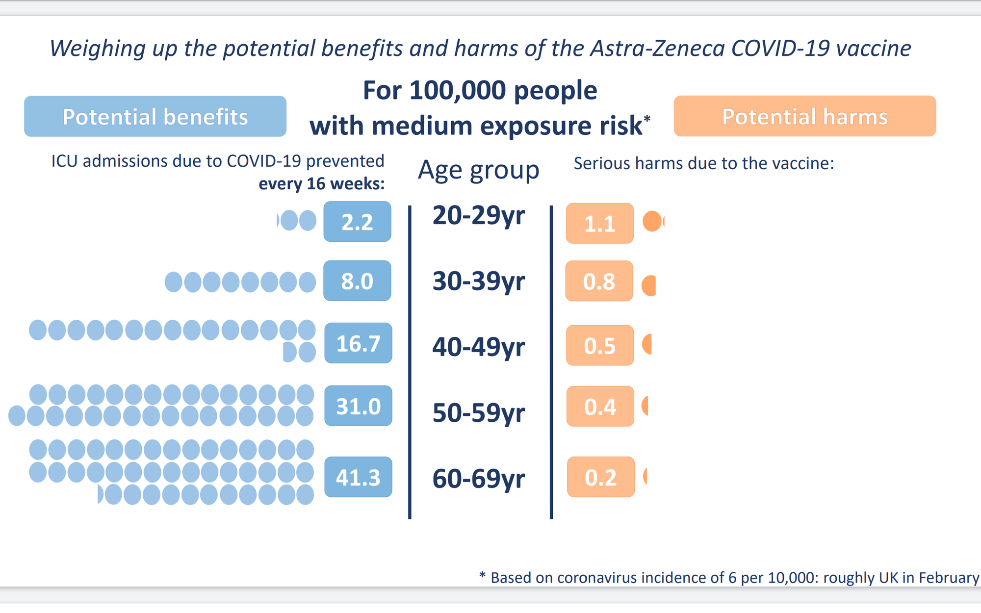
Based on the statistical notes to the guide the risk is based on the likelihood of contracting coronavirus over a 16 week period when it is circulating in the community at a prevalence rate of 2 active cases per 10,000 people.
They then take the likelihood that you will end up in ICU after contracting it and present avoidance as the benefit, where avoidance is calculated using a vaccine efficacy of 80 percent. UK hospitalisation, ICU admission and death data supports that 80 percent efficacy assumption.
It looks to be a general base rate that doesn't address individual mitigation strategies. Clearly, if you were adopting high levels of mitigation that would impact the "potential benefits".
It may not be perfect but it is the best comparative risk representation that I have seen for AstraZeneca. For the average punter it is certainly better than flailing around amidst a flurry of percentages and the like.
One of the most important things, that unfortunately you don't pick up from just the one graphic, is the the comparative risk is not static, it depends on the prevalence of coronavirus in the community. As you can see on this graphic for "medium" exposure risk - that is, 6 active cases per 10,000 - the potential benefits increase because the possibility of contracting coronavirus increases. The risk of an adverse reaction causing serious illness is fixed however.