Hi all - the
Notam Team is looking for help in rating the best starting point for a
new Notam Design. See the ideas below.
What does great Notam Design look like? (or, how we kill the Nastygram) Original article
here.
If you were to ask a 2nd grade class to design a super readable, human-friendly, clear briefing for pilots, they’d probably come up with some good ideas. Kids have a good eye for design, and spend a lot of time drawing and coloring things in. They also have a better ability to keep concepts simple, and see problems in clearer ways than we super-smart adults do.
What they would be very unlikely to do, is propose the telegram format nonsense that we currently use (let’s call it the Nastygram). Kids would know this is dumb. People can’t read it.
Even more unlikely, if we were to imagine a scenario where there was a tender to design a Briefing system for pilots (adults this time), is that the Nastygram would win. Someone would get fired if that was even proposed.
So, if we start from scratch, what might it look like? We thought we’d ask some people with ideas – you know, designers. Here’s what we got. They used revolutionary concepts like color, plain language, normal case, and flags.
Feels like a good starting point for a discussion.
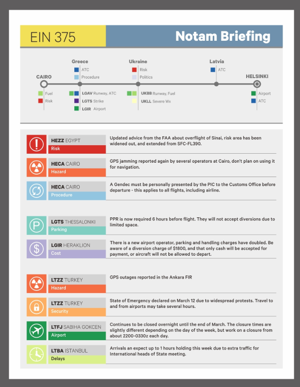
Design1:
The Colors
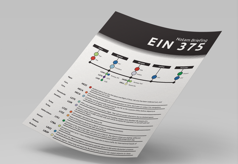
 Design 2: The Condensed
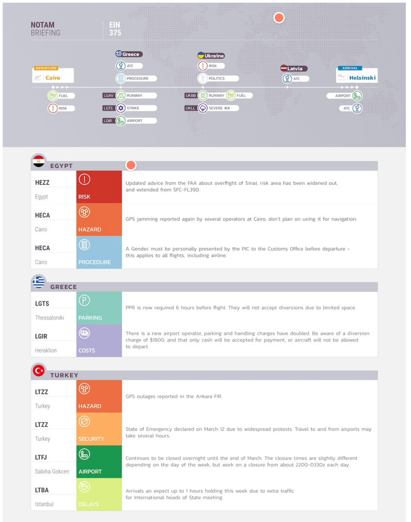
 Design 3: The Flags
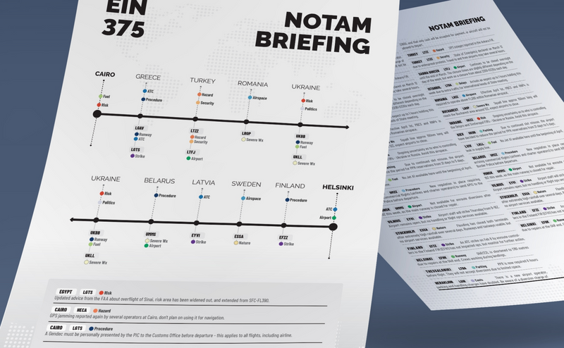
 Design 4: The Timeline
Four starting points. Will you tell us which one you like best?
We made a tiny survey (30 seconds) – just
choose your favorite here.
The design group in the Notam Team will use your feedback! Thank you!
More at:
fixingnotams.org