


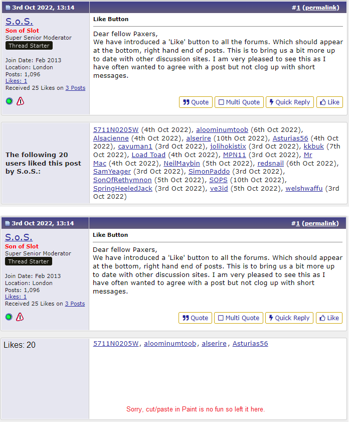
Like Button

Son of Slot
Super Senior Moderator
Super Senior Moderator
Thread Starter
Like Button
Dear fellow Paxers,
We have introduced a 'Like' button to all the forums. Which should appear at the bottom, right hand end of posts. This is to bring us a bit more up to date with other discussion sites. I am very pleased to see this as I have often wanted to agree with a post but not clog up with short messages.
We have introduced a 'Like' button to all the forums. Which should appear at the bottom, right hand end of posts. This is to bring us a bit more up to date with other discussion sites. I am very pleased to see this as I have often wanted to agree with a post but not clog up with short messages.

The following 21 users liked this post by S.o.S.:

The following 2 users liked this post by DaveReidUK:
Son of Slot
Super Senior Moderator
Super Senior Moderator
Thread Starter
Really DRUK? Nobody in PRRuNe ever dislikes anybody or their posts - as you well know. Really the very idea is shocking and I've let the CC know they are not to serve you pudding at dinner.
The following 3 users liked this post by S.o.S.:


Join Date: Mar 2010
Location: Often in Jersey, but mainly in the past.
Age: 79
Posts: 7,806
Received 135 Likes
on
63 Posts
Been available on FlyerTalk [another IB forum] for ages with no grief. I'm just not seeing the option on the Forums I use.
Son of Slot
Super Senior Moderator
Super Senior Moderator
Thread Starter
Yes. Each company implements features in their own way. What we have is what we have. Not ideal but we Mods think it is better than nothing. As you may know, we Mods are independent and do this because we enjoy it. I have the smallest responsibility which is the 'Cabin' and I don't have authority in any other forum. For the most part, I avoid Jet Blast!! Sometimes regulars in here ask me questions or voice concerns about other forums in PPRuNe and that is fine, glad to help if I can.
check Problems and queries - the Mods are keeping people posted there


A thread named after them on Jet Blast I'll bet
but fame! Fame !! FAME!!!!
put it in your CV!
put it in your CV!
Regarding the "Like" button. Good stuff, I have often wanted to send an appreciation but didn't feel it was worth cluttering up the forum with it and so usually refrained.
I do feel that the "Like" reporting leaves a little to be desired. Hope you don't mind me sticking my oar in, of course feel free to ignore me completely:-)
I disliked the bold "The following NN users liked this post by XXX:" so much that I made a browser filter for it and I don't see it. There does need to be something there though if only for new users.
Suggestion - Make the text much shorter and much less prominent. For example just make it say "Likes: NN", or "NN Likes". Change the font to not bold. Put it at the top left of the box, to me it looks weird floating in the middle.
2.
I don't like the prominence of the actual likes field relative to the rest. My eyes keep getting drawn to it.
Suggestions -
A. Most user names are mostly lower case and so the blue text is maybe OK. Does two spaces after the comma work, doesn't work on pPrune messages I don't think?
B. I think the date is FAR too prominent. I would just do away with it. If you like it then use a smaller font (because the digits are effectively capitals). Get rid of the brackets. Maybe just have month and year? Maybe consider a softer colour, but there are probably enough colours already.
Following from my last post here is another aviation forum I sometimes look at.
The likes reporting (and perhaps all controls) are much more discrete. I think this makes it easier to read the posts.
https://www.pilotsofamerica.com/comm.../#post-3314940
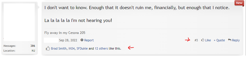
The likes reporting (and perhaps all controls) are much more discrete. I think this makes it easier to read the posts.
https://www.pilotsofamerica.com/comm.../#post-3314940
Rather than "dislike" perhaps a "disagree" button might be a little softer? 