


History and Nostalgia Calendar Please

Thread Starter
Join Date: Jan 2003
Location: Bris, QLD, Australia
Posts: 150
Likes: 0
Received 0 Likes
on
0 Posts
History and Nostalgia Calendar Please
The Rotorheads Forum has a great monthly desktop calendar. It would be great if someone could make one, using some of the 'Brilliant Pics' posted on this forum.
Thanks in advance.
Spec.
Thanks in advance.
Spec.

Thread Starter
Join Date: Jan 2003
Location: Bris, QLD, Australia
Posts: 150
Likes: 0
Received 0 Likes
on
0 Posts
G'day (L) Mate,
Thanks for your interest. Choosing a photo may be the hardest decision of the month.
The sky's the limit, with so many to choose from. After a quick scan back over some posts in 'Dedicated Nome for Brilliant Pics', here are a few suggestions.
The Lightning, Flying Lawyer post 20th Oct 2008 (any connection with your handle ?)
Any from Old Warden Bill16STN 21st Aug 2008 (or others)
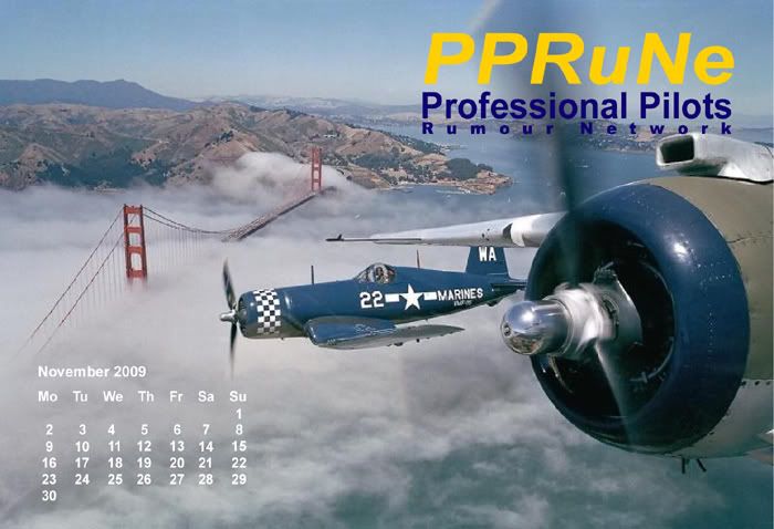
For yankee warbird enthusiasts, the Corsair over the Golden Gate, evansb 20th Mar 2009
I find a pic with clear space around the border for your desktop icons is good, as the main subject doesn't get obscured.
Maybe John Eacott who does the Rotorheads one could offer some advice. I haven't noticed a similar calendar on other forums I frequent, but maybe there is one.
All the best,
Spec.
Thanks for your interest. Choosing a photo may be the hardest decision of the month.
The sky's the limit, with so many to choose from. After a quick scan back over some posts in 'Dedicated Nome for Brilliant Pics', here are a few suggestions.
The Lightning, Flying Lawyer post 20th Oct 2008 (any connection with your handle ?)
Any from Old Warden Bill16STN 21st Aug 2008 (or others)
For yankee warbird enthusiasts, the Corsair over the Golden Gate, evansb 20th Mar 2009
I find a pic with clear space around the border for your desktop icons is good, as the main subject doesn't get obscured.
Maybe John Eacott who does the Rotorheads one could offer some advice. I haven't noticed a similar calendar on other forums I frequent, but maybe there is one.
All the best,
Spec.

Hello Specnut.
I've done a prototype and sent it to PPRuNe Pop since the illustration includes the PPRuNe logo.
It is indeed of the Lightning at dusk, but then, what else would I use!
I'll start looking at the other photo suggestions.
This could catch on, although all twelve might take some time.
LM
I've done a prototype and sent it to PPRuNe Pop since the illustration includes the PPRuNe logo.
It is indeed of the Lightning at dusk, but then, what else would I use!
I'll start looking at the other photo suggestions.
This could catch on, although all twelve might take some time.
LM
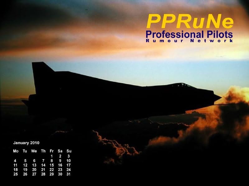
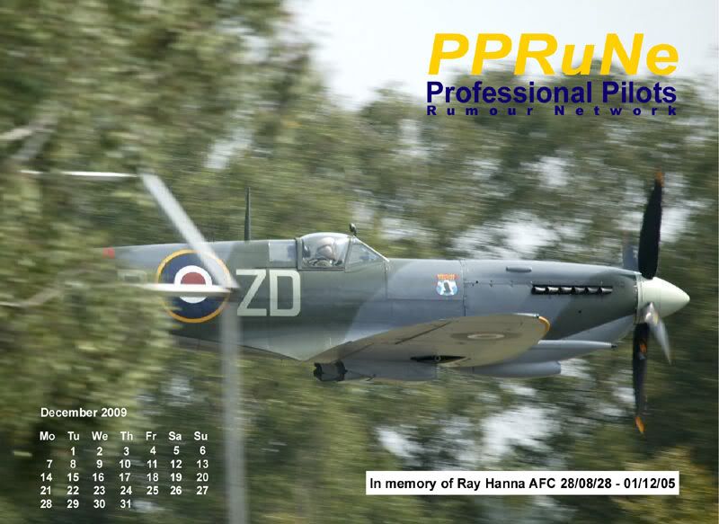
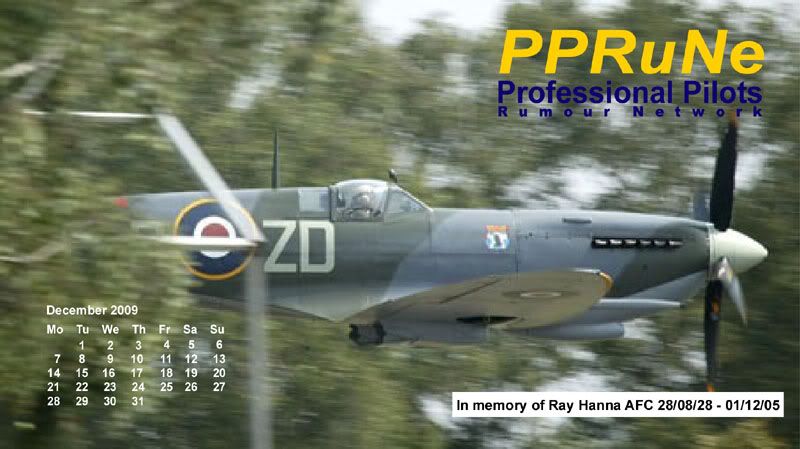
Gentlemen,
Herewith prototype January 2010.
It has been suggested via PM that I include somewhere "Aviation History & Nostalgia".
I am open to all suggestions/criticisms. I am aware that the blue in the site logo is not correct, but it will be when I change from CMYK colour system to RGB>
Such illustrations can be constructed at 16:9 and 4:3.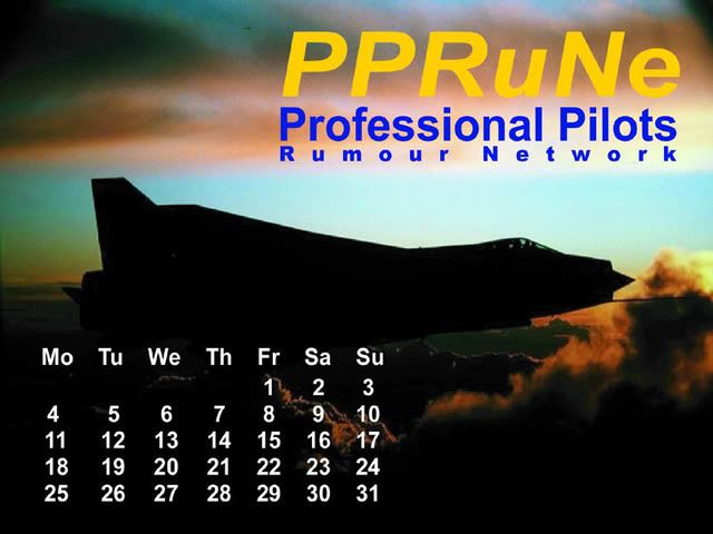
LM
Join Date: Jul 2000
Location: London
Posts: 2,916
Likes: 0
Received 0 Likes
on
0 Posts
Specnut727
I assume you meant this one - from some pics posted 19th Oct.
Agree it would make an excellent calendar pic.
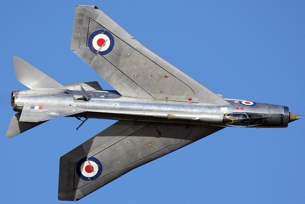
merlinxx
The only pic I've seen is the one below taken from this thread: http://www.pprune.org/aviation-histo...ml#post2243571
It's too small to be a calendar pic and not good enough quality to be enlarged.
Do you know of another?
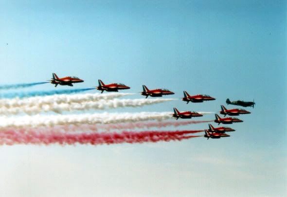
Lightning Mate
If the Ray Hanna idea appeals, there are some superb pics in the thread linked above.
December will be the 4th anniversary.
FL
The Lightning, Flying Lawyer post 20th Oct 2008
Agree it would make an excellent calendar pic.
merlinxx
MH434 with the Reds as a tribute to the late Ray H
It's too small to be a calendar pic and not good enough quality to be enlarged.
Do you know of another?
Lightning Mate
If the Ray Hanna idea appeals, there are some superb pics in the thread linked above.
December will be the 4th anniversary.
FL
Thread Starter
Join Date: Jan 2003
Location: Bris, QLD, Australia
Posts: 150
Likes: 0
Received 0 Likes
on
0 Posts
LM
Definitely on the right track. Only suggestion is to scale the logo and calendar down a little, so the photo subject is a bit more visible. The proportions on the Rotorheads calendar work well I think.
Thanks all for subject suggestions. I like the idea of using tribute pics. Could even be specials in the months of significant anniversaries.
Thanks,
Spec.
Specnut,
Point Taken. There must also be room for desktop icons, and some people use a lot of them. Standby for a revised pic as per your comment.
merlinxx,
I'll look at that site. The idea of tribute pics is appealing.
Anyone else have any comments please?
LM
Point Taken. There must also be room for desktop icons, and some people use a lot of them. Standby for a revised pic as per your comment.
merlinxx,
I'll look at that site. The idea of tribute pics is appealing.
Anyone else have any comments please?
LM
Gnome de PPRuNe
Join Date: Jan 2002
Location: Too close to Croydon for comfort
Age: 60
Posts: 12,614
Received 289 Likes
on
158 Posts
desktop icons, and some people use a lot of them
Great job; I can't see the revised image while I am work, but I appreciate your efforts and look forward to being able to use it!
Cheers
Treadders

LM,
There are a number of things that I can help with, if you want.
I use PS, and layers, to create the final product.
PPRuNe font was very difficult to find and reproduce: I have the image available, but it will need editing as it currently is Rotorheads specific.
It is quite important to always leave a border for icons that others will have on their desktops: certainly at the bottom, left and top of the screen.
I always create both a widescreen and a standard screen choice: not everyone has widescreen, but a stretched standard image can look horrible on wide, and vice versa.
Hosting and thumbnails are also important.
If you want to e mail me a decent hi res image, I'll show you what I mean
This is the current Rotorheads calendar for September. Click on either of the thumbnail images to go to the full size picture:
Wide screen size:

Standard screen size:

Thank you kindly John.
Please bear in mind that we are at "prototype" stage at present solely to solicit views.
As I said in a previous post, I will do each one in 4:1 and 16:9 format for the reason you state.
I think I have solved the PPRuNe logo text problem - at least it looks accurate to me. For this I used Illustrator because I find the shearing facility useful and the fine control of type spacing etc. The first one didn't quite give the correct blue in CYMK, but seems to have done so using RGB.
I also take your point about a border for icons - any finished products will have this built in. Personally I prefer a black border, but some people may prefer white or a light grey shade.
I hope that you don't feel we are stealing your ideas - I have simply responded to someone elses' post.
LM
LM,
I don't put in a border as such, but rather ensure that all writing is spaced far enough in from the edge to allow icons and task bar to be seen clearly. Rotorheads calendar has been going a long time now, and you are more than welcome to any stuff that I have. Creating the calendars is now quite streamlined, but my templates are all PS: you are welcome to them if you want
I don't put in a border as such, but rather ensure that all writing is spaced far enough in from the edge to allow icons and task bar to be seen clearly. Rotorheads calendar has been going a long time now, and you are more than welcome to any stuff that I have. Creating the calendars is now quite streamlined, but my templates are all PS: you are welcome to them if you want
Gamekeeper
Join Date: Aug 2000
Location: South East
Age: 61
Posts: 215
Likes: 0
Received 0 Likes
on
0 Posts
Fantastic Lightning Mate Thanks for all the hard work......put me down for one....or more than one The Late Ray Hanna shot is just pure magic
 We do miss him and Mark
Thanks for all the hard work......put me down for one....or more than one The Late Ray Hanna shot is just pure magic We do miss him and Mark