Regarding the "Like" button. Good stuff, I have often wanted to send an appreciation but didn't feel it was worth cluttering up the forum with it and so usually refrained.
I do feel that the "Like" reporting leaves a little to be desired. Hope you don't mind me sticking my oar in, of course feel free to ignore me completely:-)
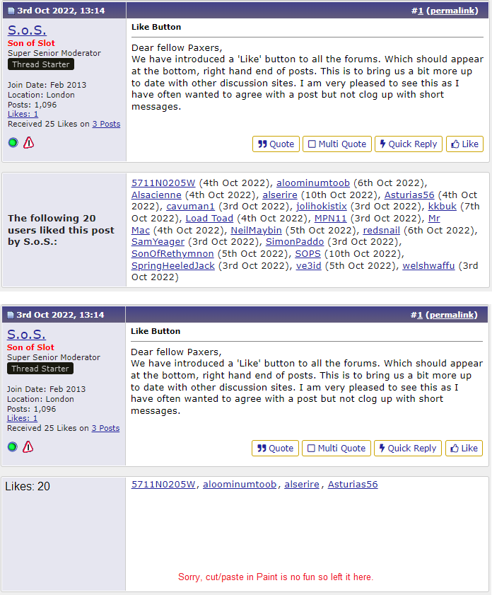
I disliked the bold "The following NN users liked this post by XXX:" so much that I made a browser filter for it and I don't see it. There does need to be something there though if only for new users.
Suggestion - Make the text much shorter and much less prominent. For example just make it say "Likes: NN", or "NN Likes". Change the font to not bold. Put it at the top left of the box, to me it looks weird floating in the middle.
2.
I don't like the prominence of the actual likes field relative to the rest. My eyes keep getting drawn to it.
Suggestions -
A. Most user names are mostly lower case and so the blue text is maybe OK. Does two spaces after the comma work, doesn't work on pPrune messages I don't think?
B. I think the date is FAR too prominent. I would just do away with it. If you like it then use a smaller font (because the digits are effectively capitals). Get rid of the brackets. Maybe just have month and year? Maybe consider a softer colour, but there are probably enough colours already.