


New Jepp format


Thread Starter
Join Date: Aug 2013
Location: PA
Age: 59
Posts: 30
Likes: 0
Received 0 Likes
on
0 Posts
New Jepp format
The company began its chart redesign effort more than two years ago, Jeppesen Airway Manual Services Aviation Portfolio Manager Andreas Windeck said during a recent NBAA webinar that gave association members an early look at the changes.
The chart redesign process included input from pilots and human factors experts. Jeppesen factored in best practices and real-world operational environment factors. The company validated proposed changes with international pilots worldwide, and then made further improvements.
“We wanted to make sure that the focus of our chart redesign efforts was centered on understanding pilots’ needs,” said Jeff Williams, a senior user-interface designer and human factors engineer at Jeppesen.
The final product will stand out from the familiar Jeppesen charts in several ways.
For example, the company is introducing colors to call attention to what pilots told the company is the most pertinent information. Among the color-coded changes are that altitude restrictions will appear in blue, while speed restrictions will be magenta.
“The prominent depiction draws attention to the important information,” Windeck said. “It’s intuitive for pilots to find that information and act accordingly.”
The new chart design also incorporates subtle graphics for key topographic features, such as a blue tint for water and shaded areas for mountains.
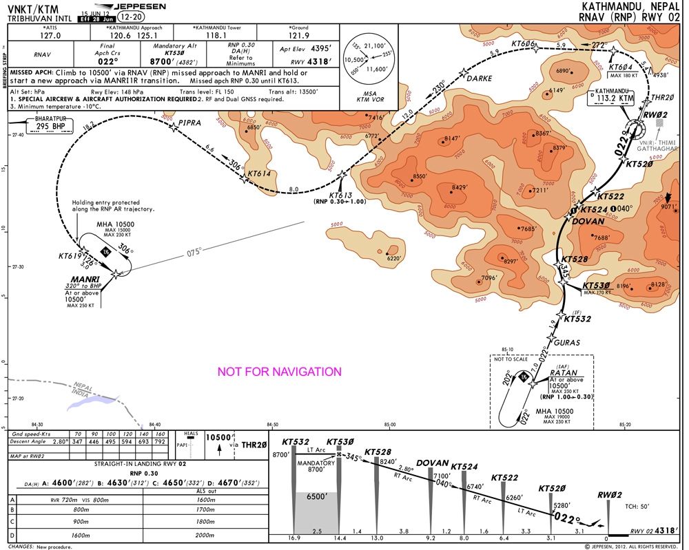
Another notable change: flight procedures on STAR and SID charts are shown to scale. While this necessitates making some charts larger, Jeppesen concluded that depicting procedures to scale improves situational awareness. It also enables use of an “own-ship” symbol when connected to a GPS.
Charts to scale and own ship tracking on GPS...interesting.
Wondering about the colors, a red light on blue is black, no? Not sure about magenta...
https://www.nbaa.org/ops/cns/pbn/201...gn-changes.php
The chart redesign process included input from pilots and human factors experts. Jeppesen factored in best practices and real-world operational environment factors. The company validated proposed changes with international pilots worldwide, and then made further improvements.
“We wanted to make sure that the focus of our chart redesign efforts was centered on understanding pilots’ needs,” said Jeff Williams, a senior user-interface designer and human factors engineer at Jeppesen.
The final product will stand out from the familiar Jeppesen charts in several ways.
For example, the company is introducing colors to call attention to what pilots told the company is the most pertinent information. Among the color-coded changes are that altitude restrictions will appear in blue, while speed restrictions will be magenta.
“The prominent depiction draws attention to the important information,” Windeck said. “It’s intuitive for pilots to find that information and act accordingly.”
The new chart design also incorporates subtle graphics for key topographic features, such as a blue tint for water and shaded areas for mountains.
Another notable change: flight procedures on STAR and SID charts are shown to scale. While this necessitates making some charts larger, Jeppesen concluded that depicting procedures to scale improves situational awareness. It also enables use of an “own-ship” symbol when connected to a GPS.
Another notable change: flight procedures on STAR and SID charts are shown to scale. While this necessitates making some charts larger, Jeppesen concluded that depicting procedures to scale improves situational awareness. It also enables use of an “own-ship” symbol when connected to a GPS.
Wondering about the colors, a red light on blue is black, no? Not sure about magenta...
https://www.nbaa.org/ops/cns/pbn/201...gn-changes.php

Thread Starter
Join Date: Aug 2013
Location: PA
Age: 59
Posts: 30
Likes: 0
Received 0 Likes
on
0 Posts
bucks,
When you do these charts, it is to a relative scale, the actual scale is not set per any criteria. In reality, most charts already are to a scale, (scale fit) because you pull the procedure from a cad system. It is a real pain to break the lines in a procedure for the chart...
Many of the charts for the RNP procedures in Canada begin from the STAR to TCH...all to scale.
This is actually to scale on the public: (except the breaks at BIXER and OOSK) and was to scale on the tailored plate.

This is to scale for the most part:

When you do these charts, it is to a relative scale, the actual scale is not set per any criteria. In reality, most charts already are to a scale, (scale fit) because you pull the procedure from a cad system. It is a real pain to break the lines in a procedure for the chart...
Many of the charts for the RNP procedures in Canada begin from the STAR to TCH...all to scale.
This is actually to scale on the public: (except the breaks at BIXER and OOSK) and was to scale on the tailored plate.
This is to scale for the most part:
Last edited by underfire; 6th Sep 2016 at 04:35.
Join Date: Mar 2001
Location: I wouldn't know.
Posts: 4,497
Likes: 0
Received 0 Likes
on
0 Posts
Gimme LIDO anytime!
